LMS Redesign & Custom Dashboards
A rebuilt LMS interface, dashboards, and navigation
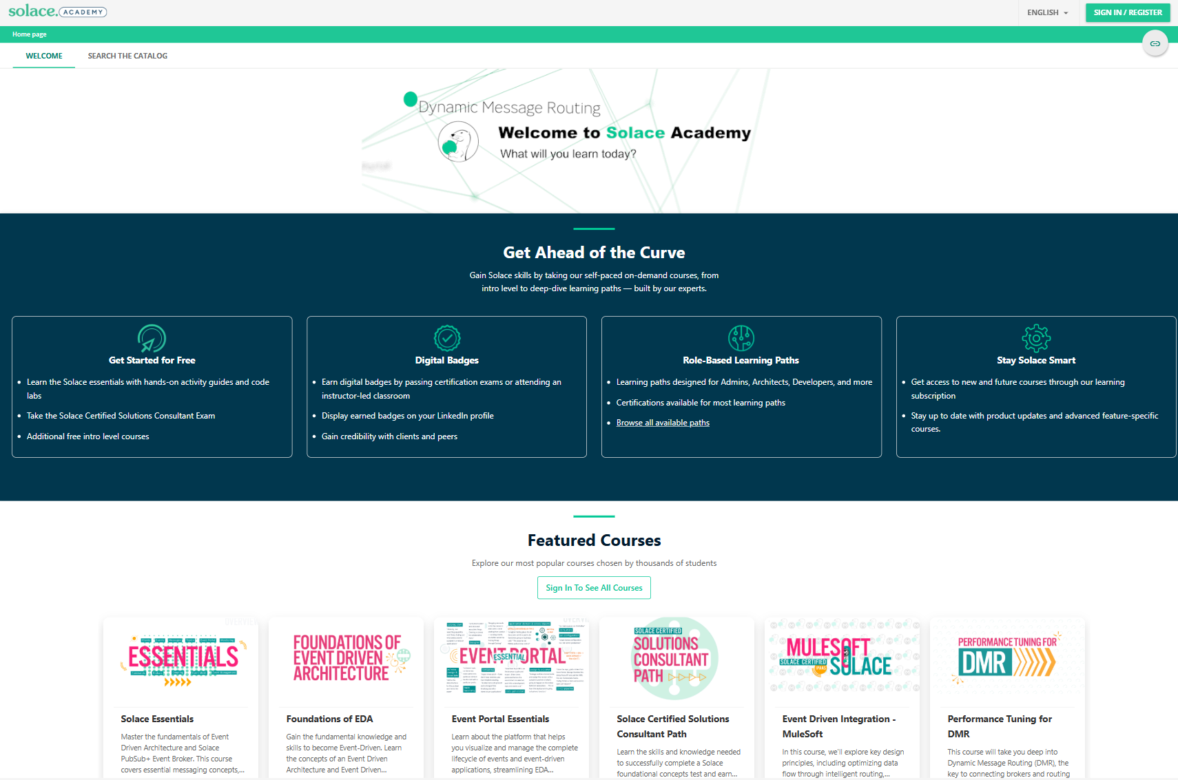
Docebo out of the box is capable but generic, and it shows. The default layout was cluttered, the navigation did not match how our learners actually think about the content, and the things people came for were buried a couple of clicks deep. The result was predictable: people bounced, and completion suffered.
It also just did not look like Solace. That matters more than it sounds, because the people logging in are not only internal staff, they are customers and partners, and generic LMS chrome quietly undercuts the sense that this is a real, cared-for part of the product.
A platform that actually looks like Solace for customers and partners
Cleaner navigation, so people find and finish courses instead of bouncing
Fewer where-do-I-find-this support questions
Role-based paths, so each kind of learner sees what's relevant to them
Interested in working together?
I'm always open to discussing new projects and opportunities in learning technology.